Your Astropress theme comes with several beautiful, professionally designed presets like “Dark,” “Nature,” and “Warm.” These are a fantastic way to get a great-looking blog with a single click. But what if you want to go a step further? What if you want your blog to perfectly match your brand’s unique identity?
That’s where the real power of Astropress customization comes in. You have complete control over the look and feel of your site, and you don’t need to be a web designer to do it.
This guide will show you how to move beyond the pre-packaged themes and create a 100% custom look that is uniquely yours.
Your Design Sandbox: The user-theme.ts File
Deep in your Astropress project files lies a special file: src/config/user-theme.ts. Think of this file as your personal design sandbox. It’s a place where you can experiment and define your own theme without breaking the default settings. Once you’re happy with your creation, you can easily apply it to your live site through your dashboard.
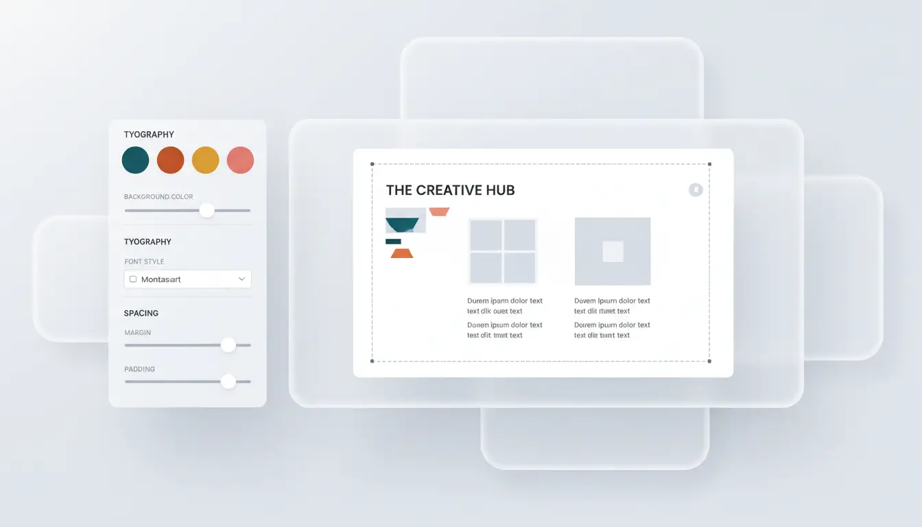
In this file, you can control three main areas:
- Colors: Change everything from the main brand color to the background and text colors.
- Typography: Define the fonts for your headings and body text.
- Sizing & Spacing: Adjust the roundness of corners, the width of your content, and more.
Let’s go through each one.
Part 1: Creating Your Custom Color Palette
Colors are the heart of your brand. To change them, you’ll look for the colors section inside the user-theme.ts file.
All you need is the “hex code” for your brand’s colors (a code that looks like #RRGGBB). You can get this from any design software or a free online tool like htmlcolorcodes.com.
Example: Creating a “Cool Blue” Theme
Let’s say your brand uses a cool blue (#3B82F6) as its primary color. Here’s how you would change it.
Find this part of the file:
// Inside export const userTheme = {
  colors: {
    primary: '#8B4513', // This is a brown color
    accent: '#DEB887',
    // ... other colors
  },
// ...
And change it to your new brand colors:
// Inside export const userTheme = {
  colors: {
    primary: '#3B82F6', // Our new cool blue!
    accent: '#10B981',  // A nice green for accents
    // ... you can change text and background colors too!
  },
// ...
Simply by changing that primary color, all your buttons, links, and other brand elements will now use your signature blue.
Part 2: Defining Your Brand’s Typography
Next up are the fonts. You can easily use any font from the massive, free Google Fonts library.
Example: Using the “Poppins” Font
- Find Your Font: Go to Google Fonts and find a font you love, like “Poppins.”
- Copy the Name: All you need is the name of the font.
- Update Your Theme File: In
user-theme.ts, find thetypographysection and change thefontHeadingorfontBody.
// Inside export const userTheme = {
  typography: {
    fontHeading: '"Josefin Sans", sans-serif',
    fontBody: '"Josefin Sans", sans-serif',
  },
// ...
Change it to:
// Inside export const userTheme = {
  typography: {
    fontHeading: '"Poppins", sans-serif', // New heading font
    fontBody: '"Poppins", sans-serif',    // New body font
  },
// ...
Your site will now use the Poppins font for all its text, giving it a completely different feel.
(Note: For the font to appear, you also need to add its import link to your site’s layout, a simple step that a developer can assist with if needed to ensure optimal loading.)
Part 3: The Final Touches (Sizing and Spacing)
This is where you can fine-tune the details. Inside the user-theme.ts file, you can also change:
borderRadius: Controls how rounded the corners are on buttons, images, and cards. A smaller value (0.25rem) gives a sharp, modern look, while a larger value (1.5rem) gives a soft, bubbly look.containerMaxWidth: Controls how wide your main content area is. You can make it narrower for a more focused, classic blog feel, or wider for a more expansive, magazine-style layout.
Activating Your New Theme
Once you have defined your perfect theme in the user-theme.ts file, the final step is to apply it. The settings in this file are not applied automatically; it is a safe place for you to experiment.
To make your theme live, you simply copy the new color, typography, and spacing values you’ve created and paste them into the corresponding fields in your main AstroPress Dashboard under Theme Settings. This way, you have a safe copy of your custom theme, and you can apply it with confidence.
And that’s it! With just a few simple edits, you’ve moved beyond the standard presets and created a beautiful, custom-branded blog that truly stands out. Happy designing!